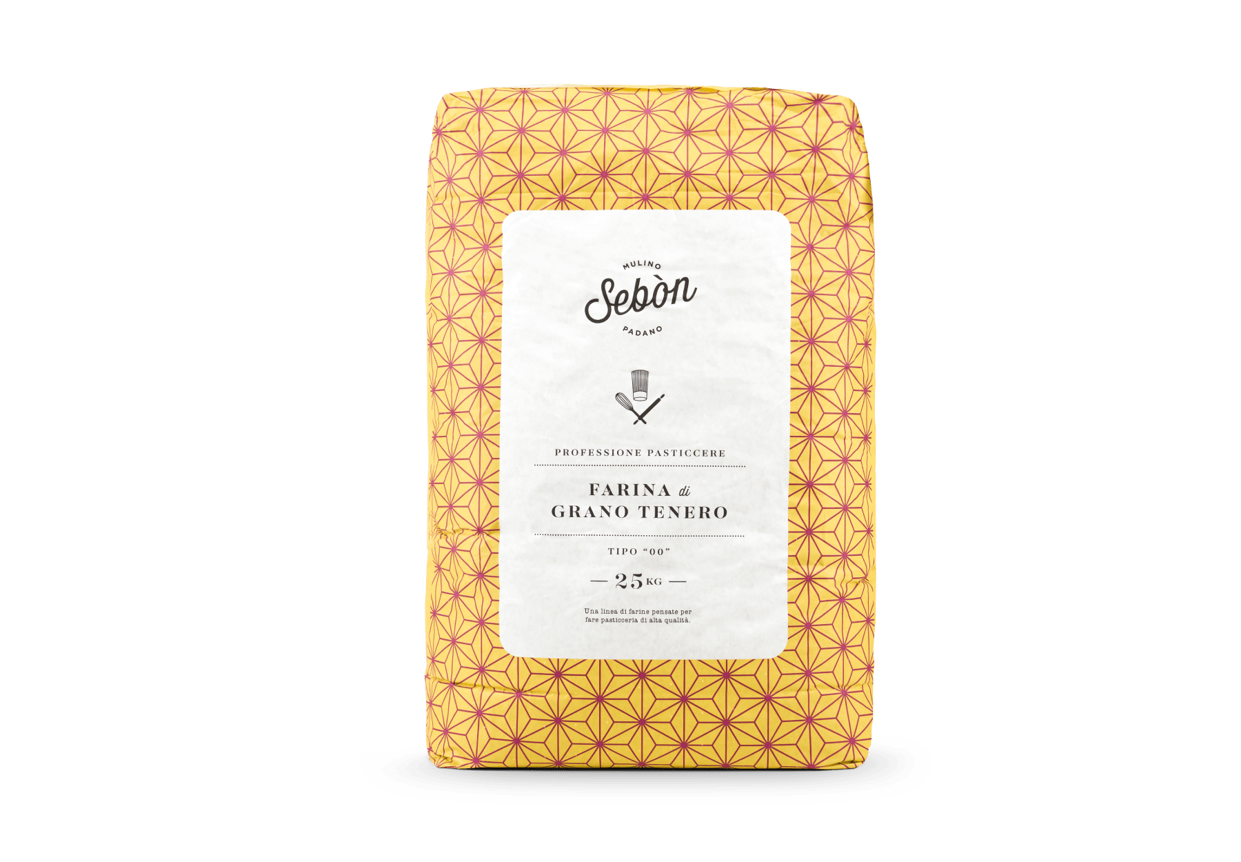
We worked on the rebranding for Mulino Padano, a historic mill in the province of Rovigo. The master millers mix the best grains to obtain flour for professional use and more. For these bags, we used minimal imagery and color to convey the reliability of a genuine and certified product made with the latest in industrial technologies.
We redesigned the packaging line, logo, website, and identity for all of their brands.
With Granaio Italiano, for example, we were inspired by their old cotton bags from the sixties that were sealed with a label made by a local typographer. Using typography that recalled the company’s past was the perfect way to pay tribute to the almost 100-year history of this mill owned by a family that handed down their knowledge throughout the generations. We reinterpreted their old graphic in a contemporary way, using typography and colors that give a nostalgic but modern touch to the most traditional line of flours by Mulino Padano.


